Using Grotesque Sans-Serifs in 2020
The world's favorite fonts are back in style. The problem? Most were never meant to be displayed on screens. Here's some tips for using them in today's digital world.
Travis Root, July 2020.
Unless you're a typographer, "Grotesque sans-serif" probably sounds more like some bizarre Halloween tradition than a category of typefaces. Named by type designers in the 1800s for the way they brutally lopped off traditional decorative serifs, Grotesques are probably the most popular typefaces in the world. They're so ubiquitous you probably know their names:
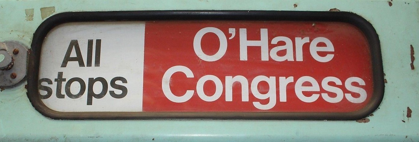
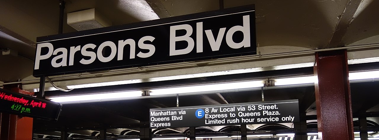
- Helvetica (famous for corporate logos, subway systems and basically everything else)
- Arial (used online and in Microsoft Word)
- Roboto (the system font for Google Android)
- San Francisco (the system font for Apple iOS and MacOS)
There's a good chance you see a Grotesque every single day, unless you live in space or something. Wait, scratch that; the NASA brand uses Helvetica.
Why they're everywhere
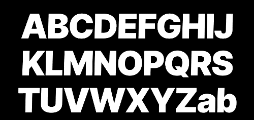
Grotesques share a kind of internal visual consistency that designers have loved since the second Industrial Revolution. They tend to have very closed forms, with lines looping back on themselves in letters like lowercase e, c, s and g. They also tend to have high x-heights, which allow lowercase letters to run the show. And they understate the differences between the shapes of individual letters by removing flourishes and forcing angles to align with each other.
The resulting letterforms are timelessly clean:

The price of beauty
This cleanliness comes at a cost. Notice how all those examples were printed, not on digital screens? That's because Grotesques were never meant to be displayed in pixels. They were designed to be forged into metal presses and stamped onto giant signs, not squinted at on a grainy cell phone screen in direct sunlight.
All the little things that make Grotesques beautiful hinder their legibility at small sizes and screen resolutions. The closed forms blend together, making c look like o and 9 look like g. The uniform shapes make the number 1, the lowercase l and the uppercase I nearly indistinguishable from each other. Good luck reading about Ii Naosuke in Arial on a sunny day. Or anything, for that matter.
The rise of Humanist Type
Because of this, there was a noticeable decline in the popular usage of Grotesques between 2000 and 2019. Instead, another category was pushed to the forefront: Humanist sans-serifs. Verdana. Open Sans. Lucida Sans. Segoe.
Based more closely on human handwriting, they emphasized the differences between letterforms and preferred to leave their shapes more open-ended. The curves of lowercase c, g, e and s would end by shooting straight out instead of wrapping back in on themselves. Lowercase t regained its traditional triangular shape. And in many cases, care was taken to disambiguate between letters, numbers and symbols that looked too similar.
The result was a type of type that could be read effortlessly at small sizes and on screens with low resolutions. Apple switched its Mac system font to Lucida Sans, Microsoft switched its system font to Segoe and the default Microsoft Office font to Calibri, and the Google-championed Open Sans began to grace the web far and wide.
Though Humanist sans-serifs (and other screen-optimized fonts like the bitmap one above) looked a bit clunky, this was probably a good move. The digital world was becoming more interactive, more democratized, and it was now easier to read.
End of story, right? Why are we talking about Grotesques if they're old and busted?
Because it turns out, when something is beautiful, designers will work real hard to keep it around.
The new generation of Grotesques
In 2010, the iPhone 4 launched with a 300dpi screen, one of the first consumer screens with a resolution high enough to rival print. This meant digital type could start to actually look good. As competitors released their own high-density screens and tech companies invested more into the design of their user interfaces, their typographers started meshing together the legibility advantages of Humanist typefaces with the uniform beauty of Grotesques.
At the same time, type foundries began modifying Grotesques with new optimizations for screens and small sizes. Others created brand new interpretations of what a Grotesque could be, such as Aktiv Grotesk, Founders Grotesk, and Public Sans. Advancements in the OpenType protocol began to allow for an added layer of algorithmic flexibility; Type could now adapt automatically to its environment, changing its spacing and even variably reshaping certain forms to be easier to read.
Google's Roboto went through a number of public iterations, ripping forms from other successful designs such as a loose e and g, a boxy stance, and round punctuation. Apple's San Francisco was less experimental in looks but more technically precise, with its forms shifting subtly to accomodate different sizes, weights and applications. Before long, both were pushed to every phone and smartwatch in the country. Grotesque fever was officially back on, baby. Even Netflix created one.
What's old is new again. Now it's your turn to take them for a spin.
Using Grotesques in 2020
Now that we've got the history out of the way, here are my tips and tricks to using Grotesks in today's digital-first environment:
- Use a new one. The oldies like Akzidenz-Grotesk and Helvetica are still cool for print, but as the Verizon website demonstrates, even a gorgeous revival like Neue Haas Grotesk can look a bit out of place online. The forms are just too bulky, the punctuation just too square. And don't use Arial, unless it's as a last resort (or you're a big proponent of plagarism).
- Use one with accessibility features. Univers is beautiful, but it was designed before accessibility in type had been properly studied, so some releases of it lack features that can improve legibility such as optional "disambiguation" glyphs. Look for a curved lowercase l, serifs on uppercase I, more open forms at smaller sizes, and alternate digits. It's not life-or-death, but it's good to have options.
- Critical info needs extra care. Another reason why accessibility features are important: small bits of important info can get lost if your typeface's letters or numbers are too closed. To combat this, lots of modern Grotesques have optional alternate characters to help differentiate things. When Apple released San Francisco, they gave an excellent demonstration of this and other features in the context of their Apple Watch display. Be sure to check out the Glyphs tab in Adobe programs and read the typeface's documentation to see all your options.
- Be careful with body copy. Grotesques aren't generally designed to be used in paragraphs. Your users will benefit from more space between letters, more open forms, more vertical leading (line height), and lighter weights at smaller sizes. Rasmus Andersson's Inter excels at this, as it automatically adjusts these values on the fly. Other typefaces like Helvetica Now split themselves into Display, Text and Micro versions, with slightly different forms for each application; make sure you're using the right one. And remember, if your users are going to benefit from a serif or humanist sans in your body copy, you owe it to them to just use one.
- At display weight, go wild. Grotesques were made to be big and bold. Typesetting a heavy header with one is a bit like taking a Ferarri to a salt flat: it's your chance to really open it up. In this context, feel free to ignore all the legibility-focused quirks like open terminals and loose tracking. Let it dominate your composition. Very few people are gonna have trouble differentiating the letters at those sizes, and they'll be too blown away to care.
- Experiment with pairings. Since Grotesques are happiest when used in display weights, look into serifs or monospace fonts for your other needs. If you can achieve a good contrast between the two, you can aid legibility and add visual interest. Alternatively, with some of the modern Grotesques that do well at small sizes like Inter and Roboto, try reversing it and using a display-weight serif like Bely Display for a trendy take.
- Ignore the naysayers. Once something becomes popular, people are bound to hate on it. After the documentary on Helvetica came out, I've seen countless articles published about how awful it is. I've had conversations with designers who only use humanist sans-serifs because "Roboto looks old." Just shrug and go back to making amazing things with whatever typeface you want.
- That said, don't try to force it into everything. There is no one font to rule them all. In applications with lots of numbers that need to be lined up, like financial spreadsheets, monospace typefaces like Consolas tend to work better. In organic or emotional applications, the cold rationality of a Grotesque might not fit. Resist the temptation to annihilate every job with Unica77 ExtraBlack. Believe me, it takes a good amount of self-control.
Oh, by the way
Surprise, you've actually been looking at a Grotesque this entire time! This website uses a modern Grotesque sans-serif, Rasmus Andersson's Inter. It's beautiful, full of futuristic features, open-source, and available for free on his website. If you enjoyed this article, your homework is to check it out. ■