Xtend, Inc.
Xtend supports credit unions and their members. As a Credit Union Service Organization (CUSO), they provide essential services to over 300 credit unions across the US, serving as an extension of their clients' staff.
As Creative Lead from 2019 to 2021, I overhauled Xtend's branding system and online presence, and created custom materials for credit unions from NYC to Wailuku.
Brand
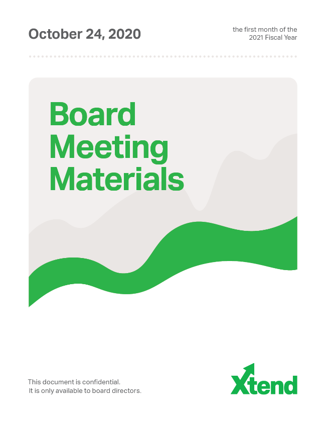
What: Xtend's first corporate branding system. To introduce the concept of sticking to a brand, I created a simplistic one that could be reproduced easily.
When: Summer 2019 - now
How: I created a Brand Standards manual, a refurbished logotype system, a full Marketing Plan, a project tracking system, new marketing materials, a series of motion graphics, and more.
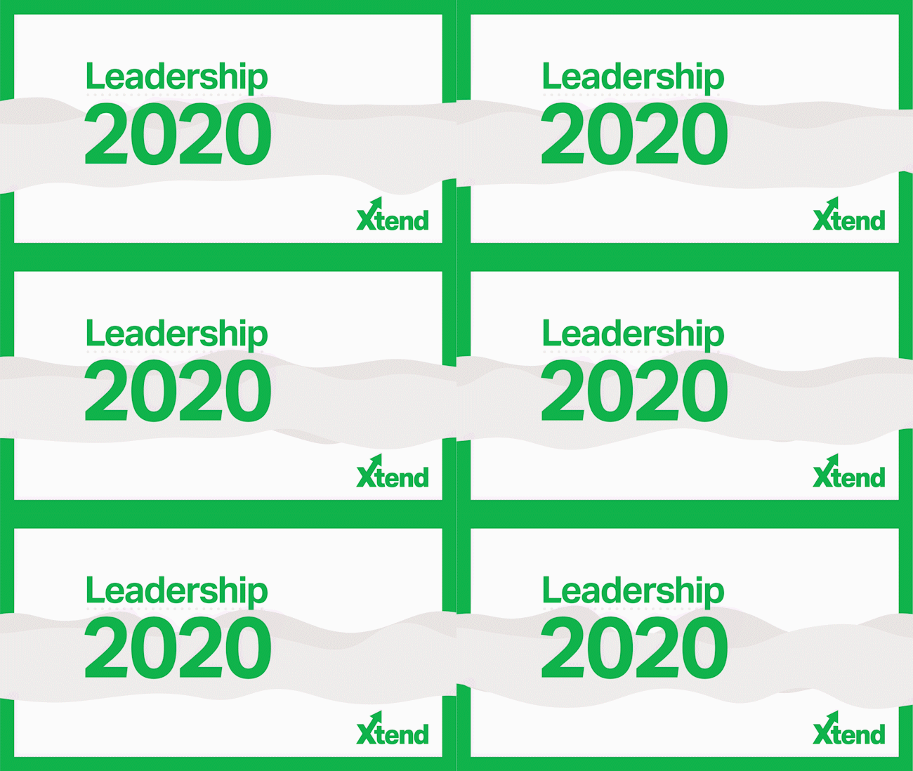
I created motion graphics for Xtend's annual Leadership conference (which became a digital event during the COVID-19 pandemic). They're a good demonstration of the brand in motion, so I've scattered them throughout this page.
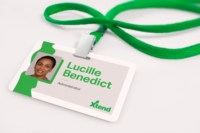
Because the company's services are largely intangible, and the company itself is averse to photography, I implemented a range of purely graphical elements:
- Abstract, playful "squiggles" that morph to fit their context
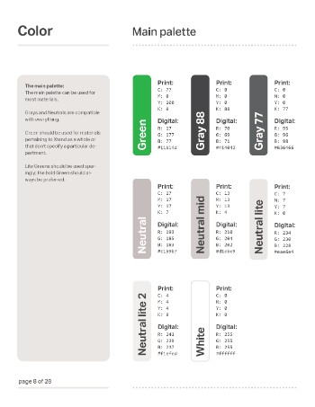
- Bright, bold colors for areas of emphasis, especially text
- Neutral-colored rectangles, often rounded and bubble-like
- Inverted, color-highlighted text
- Dotted, neutral-colored lines
- Obvious frames and margins
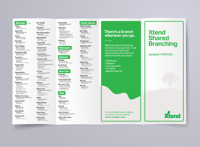
Combining these elements in different ways allowed us to create a huge range of graphical expressions without relying too heavily on photography or stock imagery.
The brand is designed to feel clean-cut without being cold. The organic lines and shapes contrast the sharpness of the logotype, and the infinite variability of the "squiggles" plays on themes of growth, creativity, and vitality.
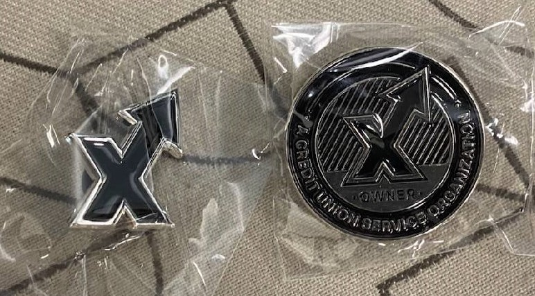
I designed enamel pins for in-person events, with a limited-edition version for the company's stockowners.
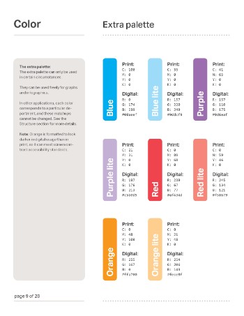
Xtend was having trouble communicating the differences between their four departments. To make it clearer for clients, I assigned each a color:
- Xtend Contact Center: energetic, friendly goldenrod
- Xtend Communications: bold, passionate red
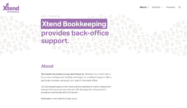
- Xtend Bookkeeping: wise, placid lavender
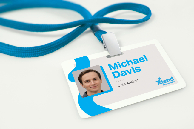
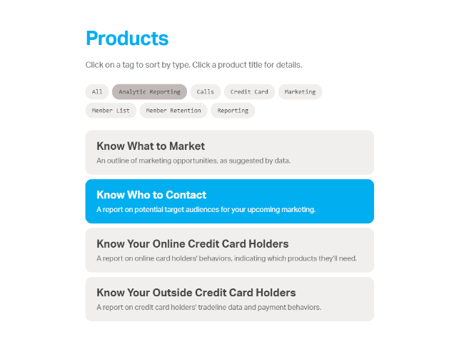
- Xtend Data Analytics: technical, precise blue
I created logotype variations for each, and highlighted these colors in department-specific materials.
I created motion infographics for Xtend Contact Center, featuring their bright goldenrod color. By keeping every other element of the brand the same, and just changing the main color, I was able to keep the brand consistent in appearance.
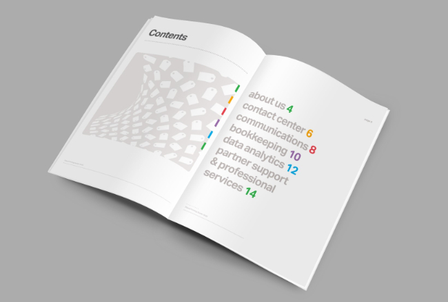
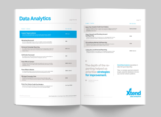
The brand colors create a spectrum when used together, as seen here in the Xtend Pricing Guide (a printed catalogue of the company's products and services).
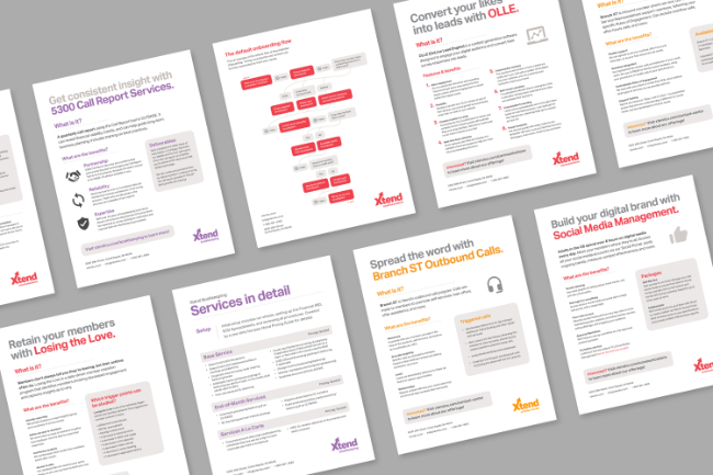
I created a consistent collection of product one-pagers for in-person sales.
I brought the brand's "squiggles" into stock photos for a Data Analytics campaign.
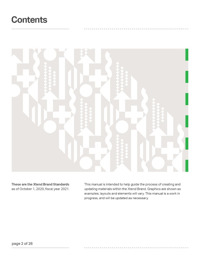
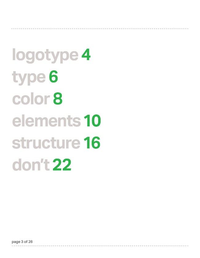
The specifics of the brand, including demos on how to use it, were extensively documented in a Brand Standards manual, a first for the company.
Team credits:
- Travis Root- Design, Copy, Animation
- Jalyn Lindeman- Project Management, Additional Copy
- Melissa Medley- Printing and Distribution
- Liz Winninger- Production Direction
Website
What: A new website for Xtend, Inc.
When: Winter 2019 - Spring 2020
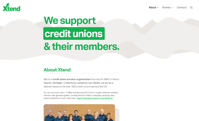
How: Using Wordpress, WPBakery and CSS, I created an all-new website that matched the updated brand and greatly simplified the ordering process for clients.
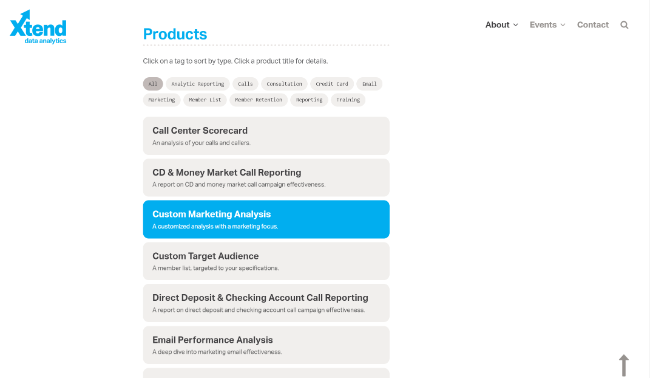
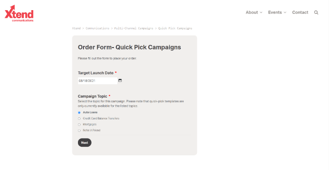
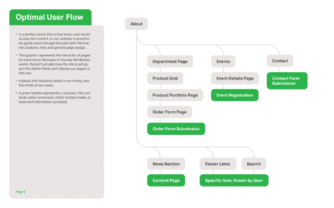
The website replaced two existing sites: an info site and a "store" site for online orders. When combining them, instead of using a standard store model (which didn't fit Xtend's intangible offerings), I designed a system around filling out service-specific order forms.
The new order form system proved to be faster and easier for clients to use.
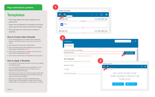
I created extensive documentation (with visual aids and plain English) and trained my teammates on how to maintain the site.
Team credits:
- Travis Root- Design, Programming, Copy
- David Damstra- Backend Administration, Additional Programming
- Jalyn Lindeman- Project Management, Additional Copy
- Liz Winninger- Production Direction
- Megan Pieper- Additional Copy, Testing
- Sarah Ashby- Additional Copy, Testing
- Aaron Hawkes- Additional Copy, Testing
Success Credit Union
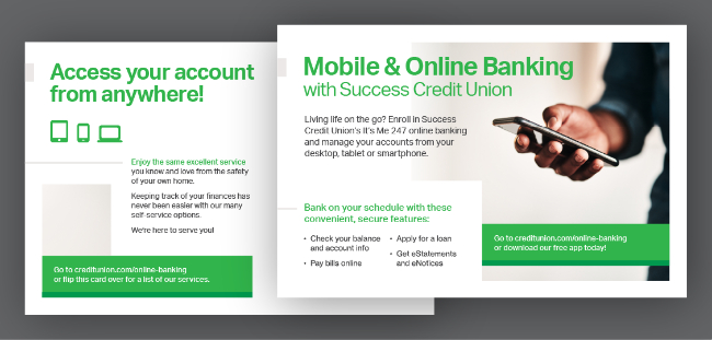
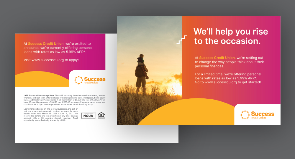
What: A set of credit union ad campaign templates, demonstrated via the fictional "Success Credit Union" brand.
When: Winter 2020 - Spring 2021
Because campaigns would run on 5+ channels at once, I had to create lots of alternate layouts of the same graphics.
Team credits:
- Travis Root- Design, Copy
- Genevieve Morgan- Additional Copy, Additional Design
- Jalyn Lindeman- Project Management

